Bootstrap 5 Alpha Finally Launched!
- Posted on June 12, 2022
- Technology
- By John Doe
- 343 Views
Bootstrap 5’s very first alpha has arrived! We’ve been working hard for several months to refine the work we started in v4, and while we’re feeling great about our progress, there’s still even more to do.

We’ve been focused on making the migration from v4 to v5 more approachable, but we’ve also not been afraid to step away from what’s outdated or no longer appropriate. As such, we’re very happy to say that with v5, Bootstrap no longer depends on jQuery and we’ve dropped support for Internet Explorer. We’re sharpening our focus on building tools that are more future-friendly, and while we’re not fully there yet, the promise of CSS variables, faster JavaScript, fewer dependencies, and better APIs certainly feel right to us.
Before you jump to updating, please remember v5 is now in alpha—breaking changes will continue to occur until our first beta. We haven’t finished adding or removing everything, so check for open issues and pull requests as you have questions or feedback.
Now let’s dig in with some highlights!
New look and feel
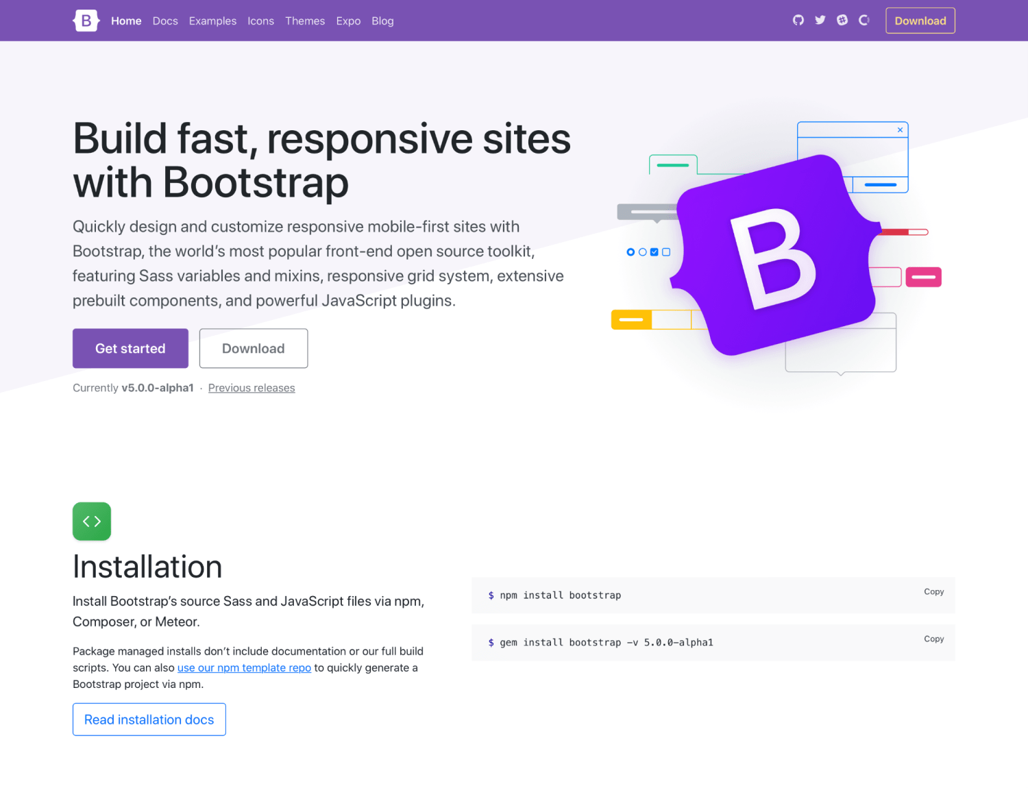
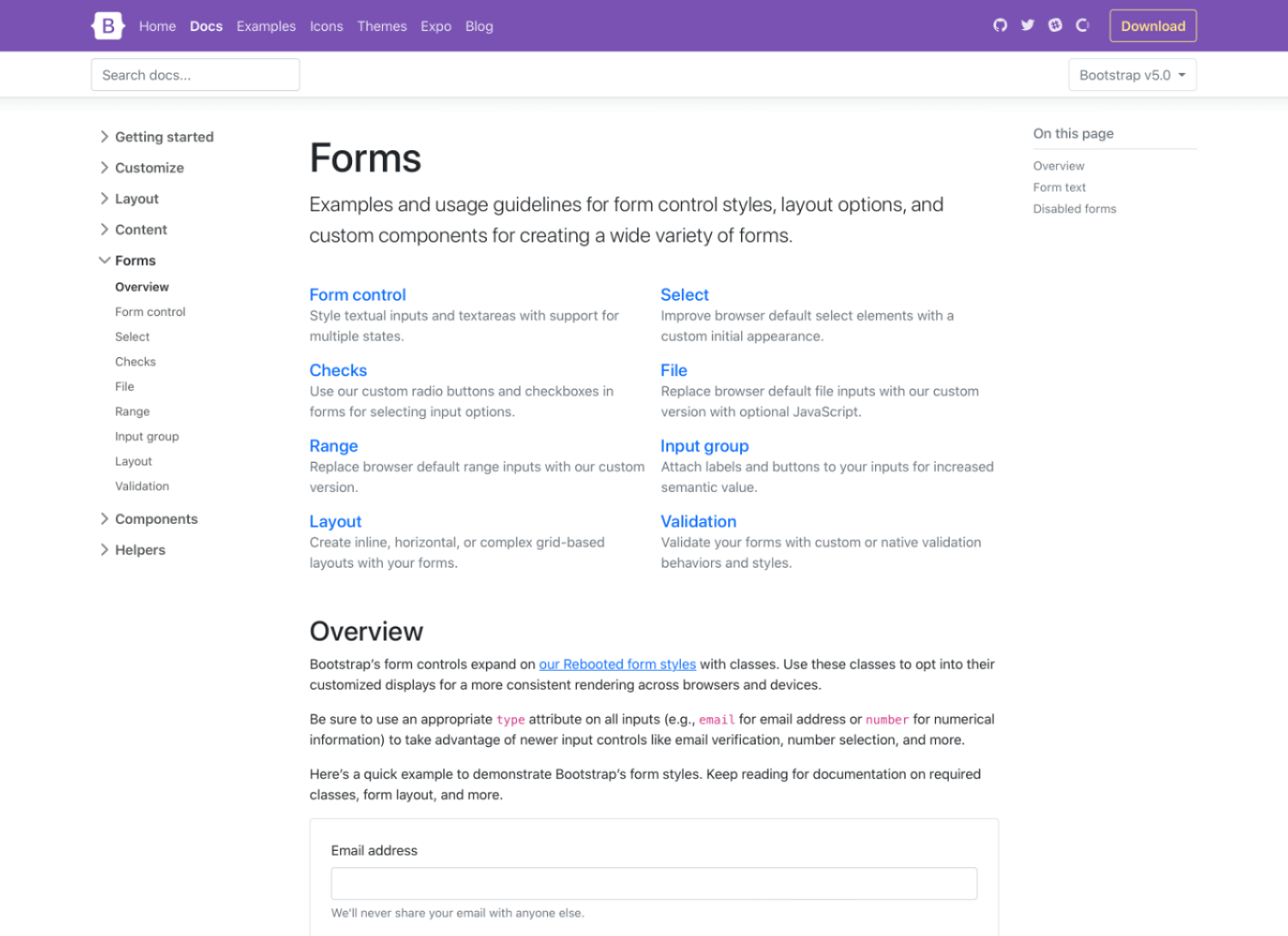
We’ve built on the improvements to our docs homepage in v4.5.0 with an updated look and feel for the rest of our docs. Our docs pages are no longer full-width to improve readability and make our site feel less app-like and more content-like. In addition, we’ve upgraded our sidebar to use expandable sections (powered by our own Collapse plugin) for faster navigation.

We’re also sporting a brand new logo! More on that when v5 goes stable, but suffice to say we wanted to give the ol’ B in a rounded square a small upgrade.

Inspired by the CSS that created the very beginnings of this project, our logo embodies the feeling of a rule set—style bounded by curly braces. We love it and think you will, too. Expect to see it roll out to v4’s documentation, our blog, and more over time as we continue to refine things and ship new releases.
jQuery and JavaScript
jQuery brought unprecedented access to complex JavaScript behaviors to millions (billions?) of people over the last decade and a half. Personally, I’m forever grateful for the empowerment and support it gave me to continue writing front-end code, learning new things, and embracing plugins from the community. Perhaps most importantly, it’s forever changed JavaScript itself, and that in itself is a monument to jQuery’s success. Thank you to every jQuery contributor and maintainer who made that possible for folks like me.
Thanks to advancement made in front-end development tools and browser support, we’re now able to drop jQuery as a dependency, but you’d never notice otherwise. This migration was a huge undertaking by @Johann-S, our primary JavaScript maintainer these days. It marks one of the largest changes to the framework in years and means projects built on Bootstrap 5 will be significantly lighter on file size and page load moving forward.
In addition to dropping jQuery, we’ve made a handful of other changes and enhancements to our JavaScript in v5 that focus on code quality and bridging the gap between v4 and v5. One of our other larger changes was dropping the bulk of our Button plugin for an HTML and CSS only approach to toggle states. Now toggle buttons are powered by checkboxes and radio buttons and are much more reliable.
You can see the full list of JS related changes in the first v5 alpha project on GitHub.
Interested in helping out on Bootstrap’s JavaScript? We’re always looking for new contributors to the team to help write new plugins, review pull requests, and fix bugs. Let us know!
CSS custom properties
As mentioned, we’ve begun using CSS custom properties in Bootstrap 5 thanks to dropping support for Internet Explorer. In v4 we only included a handful of root variables for color and fonts, and now we’ve added them for a handful of components and layout options.
Take for example our .table component, where we’ve added a handful of local variables to make striped, hoverable, and active table styles easier:
.table {
                --bs-table-bg: #{$table-bg};
                --bs-table-accent-bg: transparent;
                --bs-table-striped-color: #{$table-striped-color};
                --bs-table-striped-bg: #{$table-striped-bg};
                --bs-table-active-color: #{$table-active-color};
                --bs-table-active-bg: #{$table-active-bg};
                --bs-table-hover-color: #{$table-hover-color};
                --bs-table-hover-bg: #{$table-hover-bg};

                // Styles here...
                }
We’re working to utilize the superpowers of both Sass and CSS custom properties for a more flexible system. You can read more about this in the Tables docs page and expect to see more usage in components like buttons in the near future.
Improved customizing docs
We’ve hunkered down and improved our documentation in several places, giving more explanation, removing ambiguity, and providing much more support for extending Bootstrap. It all starts with a whole new Customize section.

v5’s Customize docs expand on v4’s Theming page with more content and code snippets for building on top of Bootstrap’s source Sass files. We’ve fleshed out more content here and even provided a starter npm project for you to get started with faster and easier. It’s also available as a template repo on GitHub, so you can freely fork and go.

We’ve expanded our color palette in v5, too. With an extensive color system built-in, you can more easily customize the look and feel of your app without ever leaving the codebase. We’ve also done some work to improve color contrast, and even provided color contrast metrics in our Color docs. Hopefully, this will continue to help make Bootstrap-powered sites more accessible to folks all over.
Updated forms
In addition to the new Customize section, we’ve overhauled our Forms documentation and components. We’ve consolidated all our forms styles into a new Forms section (including the input group component) to give them the emphasis they deserve.

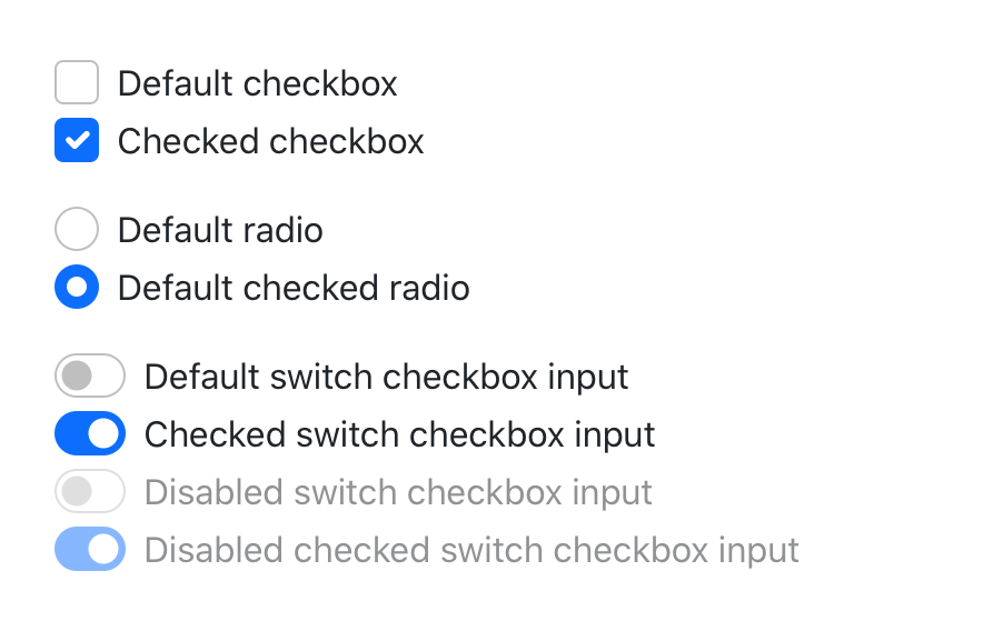
Alongside new docs pages, we’ve redesigned and de-duped all our form controls. In v4 we introduced an extensive suite of custom form controls—checks, radios, switches, files, and more—but those were in addition to whatever defaults each browser provided. With v5, we’ve gone fully custom.
 If you’re familiar with v4’s form markup, this shouldn’t look too far off for you. With a single set of form controls and a focus on redesigning existing elements vs generating new ones via pseudo-elements, we have a much more consistent look and feel.
<div class="form-check">
                <input class="form-check-input" type="checkbox" value="" id="flexCheckDefault">
                <label class="form-check-label" for="flexCheckDefault">
                    Default checkbox
                </label>
                </div>

                <div class="form-check">
                <input class="form-check-input" type="radio" name="flexRadioDefault" id="flexRadioDefault1">
                <label class="form-check-label" for="flexRadioDefault1">
                    Default radio
                </label>
                </div>

                <div class="form-check form-switch">
                <input class="form-check-input" type="checkbox" id="flexSwitchCheckDefault">
                <label class="form-check-label" for="flexSwitchCheckDefault">Default switch checkbox input</label>
                </div>
Every checkbox, radio, select, file, range, and more includes a custom appearance to unify the style and behavior of form controls across OS and browser. These new form controls are all built on completely semantic, standard form controls—no more superfluous markup, just form controls and labels.
Be sure to explore the new forms docs and let us know what you think.
Utilities API
We love seeing how many folks are building new and interesting CSS libraries and toolkits, challenging the way we’ve built on the web for the last decade-plus. It’s refreshing, to say the least, and affords us all an opportunity to discuss and iterate. As such, we’ve implemented a brand new utility API into Bootstrap 5.
$utilities: () !default;
                $utilities: map-merge(
                (
                    // ...
                    "width": (
                    property: width,
                    class: w,
                    values: (
                        25: 25%,
                        50: 50%,
                        75: 75%,
                        100: 100%,
                        auto: auto
                    )
                    ),
                    // ...
                    "margin": (
                    responsive: true,
                    property: margin,
                    class: m,
                    values: map-merge($spacers, (auto: auto))
                    ),
                    // ...
                ), $utilities);
Ever since utilities become a preferred way to build, we’ve been working to find the right balance to implement them in Bootstrap while providing control and customization. In v4, we did this with global $enable-* classes, and we’ve even carried that forward in v5. But with an API based approach, we’ve created a language and syntax in Sass to create your own utilities on the fly while also being able to modify or remove those we provide. This is all thanks to @MartijnCuppens, who also maintains the RFS project, and is responsible for the initial PR and subsequent improvements.
We think this will be a game-changer for those who build on Bootstrap via our source files, and if you haven’t built a Bootstrap-powered project that way yet, your mind will be blown.
Heads up! We’ve moved some of our former v4 utilities to a new Helpers section. These helpers are snippets of code that are longer than your usual property-value pairing for our utilities. Just our way of reorganizing things for easier naming and improved documentation.
Enhanced grid system
By design Bootstrap 5 isn’t a complete departure from v4. We wanted everyone to be able to more easily upgrade to this future version after hearing about the difficulties from the v3 to v4 upgrade path. We’ve kept the bulk of the build system in place (minus jQuery) for this reason, and we’ve also built on the existing grid system instead of replacing it with something newer and hipper.
Here’s a rundown of what’s changed in our grid:
- We’ve added a new grid tier! Say hello to xxl.
- .gutter classes have been replaced with .g* utilities, much like our margin/padding utilities. We’ve also added options to your grid gutter spacing that matches the spacing utilities you’re already familiar with.
- Form layout options have been replaced with the new grid system.
- Vertical spacing classes have been added.
- Columns are no longer position: relative by default.
Here’s a quick example of how to use the new grid gutter classes:
<div class="row g-5">
                <div class="col">...</div>
                <div class="col">...</div>
                <div class="col">...</div>
                </div>
Take a look at the redesigned and restructured Layout docs to learn more.
CSS’s grid layout is increasingly ready for prime time, and while we haven’t made use of it here yet, we’re continuing to experiment and learn from it. Look to future releases of v5 to embrace it in more ways.
Docs
We switched our documentation static site generator from Jekyll to Hugo. Jekyll has long been our generator of choice given how easy it is to get up and running, and its simplicity with deploying to GitHub Pages.
Unfortunately, we’ve reached two major issues with Jekyll over the years:
- Jekyll requires Ruby to be installed
- Site generation was very slow
Hugo on the other hand is written in Go, so it has no external runtime dependencies, and it’s much faster. We build our current master branch site, including the doc’s Sass -> CSS in ~1.6s. Our local server reloads in milliseconds instead of 8-12 seconds, so working on the docs has become a pleasant experience again.
The Hugo switch wouldn’t have been possible without Hugo’s main developer work, Bjørn Erik Pedersen (@bep), who made quite a few codebase changes to make the transition possible and smooth!
Also a shoutout to @xhmikosr who led the charge here in converting hundreds of files and working with the Hugo developers to make sure our local development was fast, efficient, and maintainable.
Coming soon: RTL, offcanvas, and more
There’s a ton we just didn’t have time to tackle in our first alpha that’s still on the todo list for future alphas. We wanted to give them some love here so you know what’s on our radar throughout v5’s development.
- RTL is coming! We’ve spiked out a PR using RTLCSS and are continuing to explore logical properties as well. Personally, I’m sorry for taking so long for us to officially tackle this knowing all the effort that’s gone into it community efforts and pull requests to the project. Hopefully, the wait is worth it.
- There’s a forked version of our modal that’s implementing an offcanvas menu. We still have some work to do here to get this right without adding too much overhead, but the idea of having an offcanvas wrapper to place any sidebar-worth content—navigation, shopping cart, etc—is huge. Personally, I know we’re behind the times on this one, but it should be awesome nonetheless.
- We’re evaluating a number of other changes to our codebase, including the Sass module system, increased usage of CSS custom properties, embedding SVGs in our HTML instead of our CSS, and more.
There’s a ton yet to come, including more documentation improvements, bug fixes, and quality of life changes. Be sure to review our open issues and PRs to see where you can help out by providing feedback, testing community PRs, or sharing your ideas.
Get started
Head to https://v5.getbootstrap.com to explore the new release. We’ve also published this updated as a pre-release to npm, so if you’re feeling bold or are curious about what’s new, you can pull the latest in that way.
npm i bootstrap@next
What’s next
We still have more work to do in v5, including some breaking changes, but we’re incredibly excited about this release. Let the feedback rip and we’ll do our best to keep up with y’all. Our goal is to ship another alpha within 3-4 weeks, and likely a couple more after that. We’ll also be shipping a v4.5.1 release to fix a couple of regressions and continue to bridge the gap between v4 and v5.
Beyond that, keep an eye for more updates to the Bootstrap Icons project, our RFS project (now enabled by default in v5), and the npm starter project.
Support the team
Visit our Open Collective page or our team members’ GitHub profiles to help support the maintainers contributing to Bootstrap.
<3,
@mdo & team


Write a Response